Task 1 Writing - Academic (Japanese tourists - 2 charts)
Posted: Tue Jun 03, 2014 8:45 pm
You should spend about 20 minutes on this task.
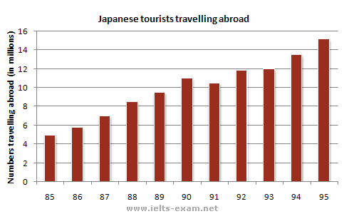
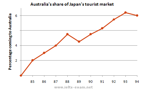
The charts below show the number of Japanese tourists travelling abroad between 1985 and 1995 and Australia’s share of the Japanese tourist market.
Summarise the information by selecting and reporting the main features, and make comparisons where relevant.
You should write at least 150 words.


My answer:
The charts depict the numbers of Japanese tourists travelling abroad and Australia's share of Japan's tourist market between 1985-1995 in both cases.
In the first chart, we can see the number of Japanese tourists travelling outside their country growing year by year between 1985 and 1995. In fact, 5 million Japanese tourists travelled abroad in 1985, while that number steadily increased the following years: 5.5 million in 1986, 7 million in 1987, 8.5 million in 1988, 9.5 million in 1989 and an astonishinh 11 million number of Japanese tourists in 1990. However, in 1991 the number dropped to 10.5 million tourists. Apart from that drop, the following years saw rises and particularly in 1995 when 15 million Japanese tourists preferred to travel outside their country.
In the second chart, we see Australia's share of Japan's tourist maarket. In 1985, 2% of Japanese tourists visited Australia, while that percentage keeps rising the following years peaking at 5% in 1989. The following year, it drops to 4,2% but as we noticed in the first chart, the years after 1990 saw a healthy increase except 1995 in which the percentage drops to 6% from 6,2% in 1990.
-----
Waiting for your comments, your tips and perhaps a score. I appreciate the time you spent reading the task and my answer. In my opinion, my answer isn't good mainly because i almost run out of time (20m) and i kinda rushed to finish it.
The charts below show the number of Japanese tourists travelling abroad between 1985 and 1995 and Australia’s share of the Japanese tourist market.
Summarise the information by selecting and reporting the main features, and make comparisons where relevant.
You should write at least 150 words.


My answer:
The charts depict the numbers of Japanese tourists travelling abroad and Australia's share of Japan's tourist market between 1985-1995 in both cases.
In the first chart, we can see the number of Japanese tourists travelling outside their country growing year by year between 1985 and 1995. In fact, 5 million Japanese tourists travelled abroad in 1985, while that number steadily increased the following years: 5.5 million in 1986, 7 million in 1987, 8.5 million in 1988, 9.5 million in 1989 and an astonishinh 11 million number of Japanese tourists in 1990. However, in 1991 the number dropped to 10.5 million tourists. Apart from that drop, the following years saw rises and particularly in 1995 when 15 million Japanese tourists preferred to travel outside their country.
In the second chart, we see Australia's share of Japan's tourist maarket. In 1985, 2% of Japanese tourists visited Australia, while that percentage keeps rising the following years peaking at 5% in 1989. The following year, it drops to 4,2% but as we noticed in the first chart, the years after 1990 saw a healthy increase except 1995 in which the percentage drops to 6% from 6,2% in 1990.
-----
Waiting for your comments, your tips and perhaps a score. I appreciate the time you spent reading the task and my answer. In my opinion, my answer isn't good mainly because i almost run out of time (20m) and i kinda rushed to finish it.