You should spend about 20 minutes on this task.
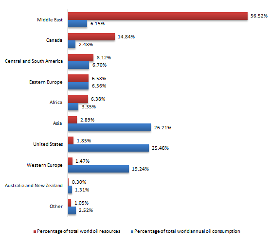
The chart below shows the proportions of the world’s oil resources held in different areas, together with the proportions consumed annually in the same areas.
Summarise the information by selecting and reporting the main features, and make comparisons where relevant.
Write at least 150 words.
Answer:
These two bar graphs illustrate the amount of total world oil resources and total world annual oil consumption. Additionally, worldwide areas are mentioned in both graphs.
In the first place is Middle East owning an incredible 56,62% of oil resources in the world. At the same time, they annually consume only 6,15% of total world oil, whereas Asia uses the most which is 26,21%, closely followed by United States at 25,48% and Western Europe which comes third as they consume 19,24% of total world oil resources in a year.
Meanwhile, the top three areas that consume the most oil every year are the ones that have the fewest oil resources. In fact, Asia holds only 2,89%, the United States are responsible for 1,85% of the world's oil and Western Europe owns 1,47% of worldwide oil resources.
On the contrary, other areas like Middle East as i previously mentioned consume less oil compared to what they own. Canada holds 14,84% but consumes a surprisingly low 2,48%. It is the same case for Africa which gets 6,38% of oil power but consumes 3,35%.
In conclusion, we notice that mainly developed areas consume bigger amounts of oil in a year compared to developing areas, while at the same time their percentage of oil resources is insignificant.
----
I need your comments in the above writing task. Thank you in advance.
Writing Task 1 (academic) - Oil Resources
Re: Writing Task 1 (academic) - Oil Resources
Really well written. You made great comparisons and your conclusion was excellent. Great job!bionic89 wrote:You should spend about 20 minutes on this task.
The chart below shows the proportions of the world’s oil resources held in different areas, together with the proportions consumed annually in the same areas.
Summarise the information by selecting and reporting the main features, and make comparisons where relevant.
Write at least 150 words.
Answer:
This bar graph illustrates the amount of total world oil resources and total world annual oil consumption.(<-- Although there are 2 separate bars for each country, overall it is only one bar graph because all the information is in one figure.) Additionally, worldwide areas are mentioned in both graphs.(<-- This sentence is unnecessary.)
It is clear that the Middle East owns an incredible 56,62% of oil resources in the world. At the same time, they annually consume only 6.15% of total world oil, whereas Asia uses the most at 26.21%, closely followed by the United States at 25.48% and Western Europe which consumes 19.24% of total world oil resources per year.
Conversely, the top three areas that consume the most oil every year are the ones that have the fewest oil resources. In fact, Asia holds only 2.89%, the United States is (<-- is instead of are because the US is a proper noun, like a name. For example, you would say, 'bionic89 is happy', not, 'bionic89 are happy.') responsible for 1.85% of the world's oil and Western Europe owns 1.47% of worldwide oil resources.
On the contrary, other areas like the Middle East, as previously mentioned, consume less oil compared to what they own. Canada holds 14.84% but consumes a surprisingly low 2.48%. It is the same case for Africa which has 6.38% of oil power but consumes only 3.35%.
In conclusion, we notice that mainly developed areas consume bigger amounts of oil per year compared to developing areas, while at the same time their percentage of oil resources is insignificant.
----